Mold your creativity
Pursuing a pottery passion can be challenging, with studios, classes, and wheel space hard to find. Enter Claymates: a unique membership service bringing the joy of pottery-making straight to your home.
Perfect for seasoned potters and enthusiastic newbies alike, Claymates members receive curated kits every month, packed with all the materials, tools, and instructions needed to create beautiful pottery pieces. They make pottery accessible, compact and convenient– even including a throwing wheel for the full hands-on experience!
With Claymates, everyone is an artist. Combining themes of clay and joyful community, the brand’s playful name is instantly memorable. They’re all about building a collaborative community where members can take part in fun thematic activities, share experiences and showcase their ceramic creations to the world.

Crafted with a human touch
To reflect their community values and creative personality, we set about creating an earthy yet elevated new visual identity for Claymates.
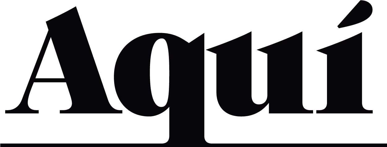
Their tagline, ‘Mold Your Creativity,’ speaks to the individuality of each unique clay creation. Reflecting this, we crafted a logo featuring ceramics of various shapes, sizes, and textures: three different pots with a rough texture, a smooth molded feel, and a matte look.
This organic and rustic feel evokes the art of pottery, showing how each piece passes through the hands of a unique person with a different style. The new logo celebrates the individuality of Claymates’ members, crafted with organic strokes to enhance the feel of human touch, like that of a ceramicist lovingly crafting a new piece.


Earthy yet elevated
Claymates aims to convey the therapeutic benefits of working with clay, celebrate the joy of pottery-making, and empower members to explore their artistic side. The new colour palette combines grounding calmness with playful joy, exuding a confident and elevated feel.
For the primary colours, we chose strong Slate Stone paired with warming Rustic Terracotta, inspired by tones of terracotta, stoneware, earthenware, and porcelain. This earthy combination creates a beautifully refined matte-finish look and feel.
To bring a clean and balanced contrast, the secondary colours are creamy Baby Powder, fresh Pearl and calming Taupe. When combined, the palette feels contemporary but rustic, like a minimalist modern ceramic studio filled with handcrafted pots.
Our chosen typeface, DM Sans, brings strength and sophistication to the visual identity. This clean sans-serif font is approachable and easy to read. Paired with the rustic logo, it adds an effortless sense of style and polish to the creative brand.